Registration Form Template Guide (With Examples)
August 24, 2026
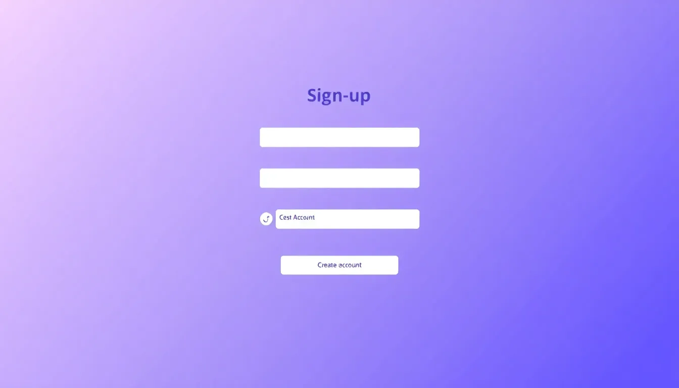
A registration form is how people sign up for whatever you are offering — an account, a course, a membership, a webinar, or a program. It is the doorway to your product or event, so it needs to be quick to complete and clear about what happens next. This guide gives you a reusable registration form template, three example variations, and the best practices that keep sign-ups high.
What a registration form is for
A registration form collects the information you need to enroll someone and follow up with them. Unlike a simple contact form, it usually creates a record you will act on: a new user account, a spot on an attendee list, or a place in a class. Use one whenever someone needs to "sign up" rather than just reach out.
Because a registration form stands between your visitor and the thing they want, friction here costs you sign-ups directly. The goal is to ask for exactly what you need to get them registered — and nothing more. You can build one in FormMaker in minutes, then embed it on your site or share the link.
Create your registration form free with FormMaker
The core registration form template
This structure works for most account and program sign-ups. Adjust the fields to your context.
- Full name — short text — required — how you will address the person
- Email — email — required — your primary way to confirm and communicate
- Password — password — required — only if you are creating a login; skip for event or list sign-ups
- Phone — phone — optional — add only if you truly need to call or text
- How did you hear about us? — dropdown — optional — useful marketing signal
- Terms and conditions — checkbox — required — confirms agreement before you enroll them
Keep required fields to the essentials. Every extra required field is a reason for someone to abandon the form.
Three registration form examples
Example 1: Account / product sign-up
The classic "create your account" form. Keep it to the bare minimum and let people fill in the rest later.
- Full name — short text — required
- Email — email — required
- Password — password — required
- Terms agreement — checkbox — required
Four fields is plenty to get someone in the door. You can enrich their profile after they are active.
Example 2: Course or program registration
When people enroll in something structured, collect a bit more to place them correctly.
- Full name — short text — required
- Email — email — required
- Phone — phone — optional
- Which course? — dropdown — required
- Experience level — radio buttons (Beginner, Intermediate, Advanced) — required
- Goals — long text — optional
- Terms agreement — checkbox — required
The course and experience-level fields let you group and prepare for registrants before day one.
Example 3: Membership registration
Memberships often need contact details and a plan choice.
- Full name — short text — required
- Email — email — required
- Address — address — optional
- Membership tier — dropdown (Basic, Plus, Pro) — required
- Billing cycle — radio buttons (Monthly, Annual) — required
- Terms agreement — checkbox — required
Send new members to a Google Sheet or your CRM automatically so onboarding starts right away.
Best practices for registration forms
- Ask only what you need to register someone. You can always collect more later. A shorter form means more completed sign-ups.
- Split long forms into steps. For registrations with many fields, a multi-step wizard form feels lighter and clearly signals progress.
- Put required fields first. Front-load name and email so people commit early, and keep optional fields near the end.
- Use clear field labels. "Work email" or "Course you want to join" beats a vague "Email" or "Selection."
- Confirm the next step. After submit, show what happens now — a confirmation email, a login link, or a start date.
- Make it mobile-friendly. Use a single-column layout, large tap targets, and dropdowns instead of long typed answers.
- Add a consent checkbox where needed. A clear terms-agreement checkbox protects you and sets expectations.
Build your registration form in minutes
In FormMaker, drag in your fields, mark the essentials required, and reorder them so the easy questions come first. For longer registrations, turn on multi-step mode to break the form into a clean wizard. Publish, then embed the form on your sign-up page or share the link by email and social. Registrations flow into your dashboard with analytics, and integrations push them to Slack, Google Sheets, or your CRM.
Build your registration form free with FormMaker
FAQ
What is the difference between a registration form and a contact form?
A contact form starts a conversation. A registration form enrolls someone — creating an account, a class spot, or a membership — so it usually collects a bit more and triggers a follow-up action.
How long should a registration form be?
As short as the task allows. For an account, four fields is common. For a course or membership, six to eight is reasonable — split those into steps if it feels long.
Should I embed the registration form or share a link?
Embed it on your sign-up page for a seamless experience, or share the link in emails, chats, and social posts when the form is the destination itself.
Can I collect payments on a registration form?
You can add a plan or amount field and route registrants to your payment step. For paid memberships, connect the form to your billing tool through integrations.
Build your first form free
Drag, drop, publish. No credit card, unlimited submissions.