Newsletter Signup Form Best Practices (+Examples)
August 24, 2026
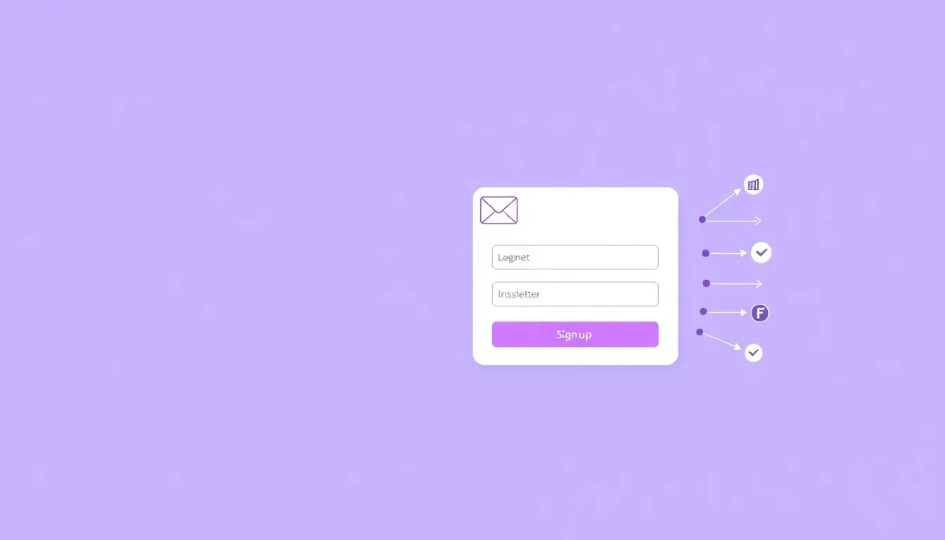
Your email list is one of the few marketing assets you actually own. Social reach comes and goes, algorithms shift, but a subscriber who opted in is yours to reach directly. The newsletter signup form is where that relationship begins, so it deserves more thought than a lonely "Subscribe" box in the footer. This guide covers newsletter signup form best practices, with concrete examples you can copy today.
Why Your Newsletter Signup Form Matters More Than You Think
A newsletter signup form is often the lowest-commitment conversion on your site. Nobody is buying, booking, or paying. They are simply saying, "Keep me in the loop." That low stakes cuts both ways: it should be easy to say yes, but it is also easy for a distracted visitor to scroll right past. Small improvements to placement, copy, and design compound across every visitor, month after month.
The goal is not just more signups. It is more qualified signups: people who genuinely want to hear from you and will open, click, and eventually buy. A misleading incentive inflates your list with people who unsubscribe at the first email. Aim for the right subscribers, not just the most.
The Core Best Practices
1. Ask for the Email and Almost Nothing Else
For a newsletter, email is usually the only field you need. Adding a first name can help personalize, but every extra field lowers completion. Shorter forms tend to convert better, and a newsletter form is the clearest case for keeping it to one or two fields.
Example: A single email field, a button that says "Get the newsletter," and one line of supporting copy. That is often the highest-converting version.
2. Sell the Value, Not the Format
"Sign up for our newsletter" describes the mechanism, not the benefit. Tell people what they get and how often.
- Weak: "Subscribe to our newsletter."
- Better: "Get one practical marketing tip every Tuesday. No fluff."
Name the frequency, the topic, and the tone. Specificity builds trust and sets expectations that reduce later unsubscribes.
3. Set Expectations Clearly
State how often you will email and what it will contain. "One email a week" or "Twice a month, unsubscribe anytime" removes the fear of a flooded inbox. Honesty here protects your open rates because subscribers know what they signed up for.
4. Use a Button That Restates the Benefit
Skip "Submit." Match the button to the promise:
- "Send me the tips"
- "Join 12,000 readers" (only if the number is real)
- "Get weekly insights"
5. Place the Form Where Attention Peaks
One form in the footer is not enough. Give people multiple, natural chances to subscribe:
- Inline at the end of blog posts, where an engaged reader just finished your content
- In a sidebar or a slide-in that appears after some scroll depth
- On a dedicated subscribe page you can link to from anywhere
- In your site header or a slim announcement bar
Match the moment to the intent. A reader who finished an article is far warmer than someone who just landed on the homepage.
Example Setups That Work
The blog-post inline form. After the final paragraph: "Enjoyed this? Get the next one in your inbox." One email field, one button. It catches readers at peak interest.
The lead-magnet form. Offer something concrete in exchange for the email: a checklist, template, or short guide. "Get the free template + weekly tips" tends to outperform a plain subscribe ask because the value is immediate and tangible.
The dedicated subscribe page. A clean page with a headline, three bullet points on what subscribers get, a sample or archive link, and the form. Link to it from your bio, footer, and social profiles.
With FormMaker you can build any of these free, embed them directly in your site or blog, or share a link to a dedicated subscribe page, then watch signups in real-time analytics.
Build a free newsletter signup form with FormMaker
Design Details That Lift Completion
- Single column, mobile first. Most email signups happen on phones. Test tap targets and the on-screen keyboard.
- High-contrast button. Make the call to action the most obvious element.
- Visible label or clear placeholder. "Enter your email" should never be ambiguous.
- Minimal distraction. Around the form, cut competing links and buttons so the eye lands on one action.
- Instant confirmation. Show a friendly success message: "You're in. Check your inbox to confirm."
Add a Confirmation Step for List Health
A double opt-in, where subscribers confirm via a link in a welcome email, keeps your list clean and your deliverability strong. It slightly lowers raw signup counts but raises engagement, which matters far more over time.
Incentives: Use Them, but Honestly
An incentive can boost signups: a discount code, a downloadable resource, or exclusive content. The rule is simple: deliver exactly what you promised. A bait-and-switch incentive fills your list with people who feel misled and churn fast. A genuine, relevant incentive attracts subscribers who value what you offer.
Good incentives include a practical checklist, a short email course, early access, or a first-order discount for ecommerce. Match the incentive to what your best subscribers actually want.
A Newsletter Signup Form Checklist
- One or two fields maximum
- Benefit-driven headline, not "Subscribe to our newsletter"
- Frequency and content set clearly
- Button copy restates the value
- Form appears in more than one high-intent location
- Mobile tested
- Success message confirms the signup
- Subscribers flow into your email tool automatically
Connect your form to your email platform, Slack, or Google Sheets so new subscribers land where you can act on them without manual work.
Frequently Asked Questions
Should I ask for a name or just an email?
Just an email in most cases. It is the highest-converting option. Add a first name only if you will genuinely use it to personalize, and know that the extra field will cost you some signups.
Where should I put my newsletter form?
In more than one place. The strongest performers are inline at the end of blog posts and on a dedicated subscribe page, backed up by a header bar or slide-in. Give engaged readers a natural moment to say yes.
Do incentives hurt subscriber quality?
Only when they are irrelevant or misleading. A genuine, on-topic incentive attracts the right people. Deliver exactly what you promised and your list stays healthy.
Bring It Together
A great newsletter signup form is short, honest, and placed where attention is highest. Sell the specific benefit, set clear expectations, keep the design clean and mobile-friendly, and confirm every signup. Do that consistently and your list, the asset you actually own, grows with subscribers who want to hear from you.
Build your first form free
Drag, drop, publish. No credit card, unlimited submissions.